
Dink Press Rebrand
Redesign of the Dink Press Logo and Personality
As a stepping stone for up and coming writers, Dink Press approached me with hopes for a new brand. Their goal was simple: to create a recognizable and memorable rebrand that emphasizes Dink's personality and attitude.
REDESIGNING
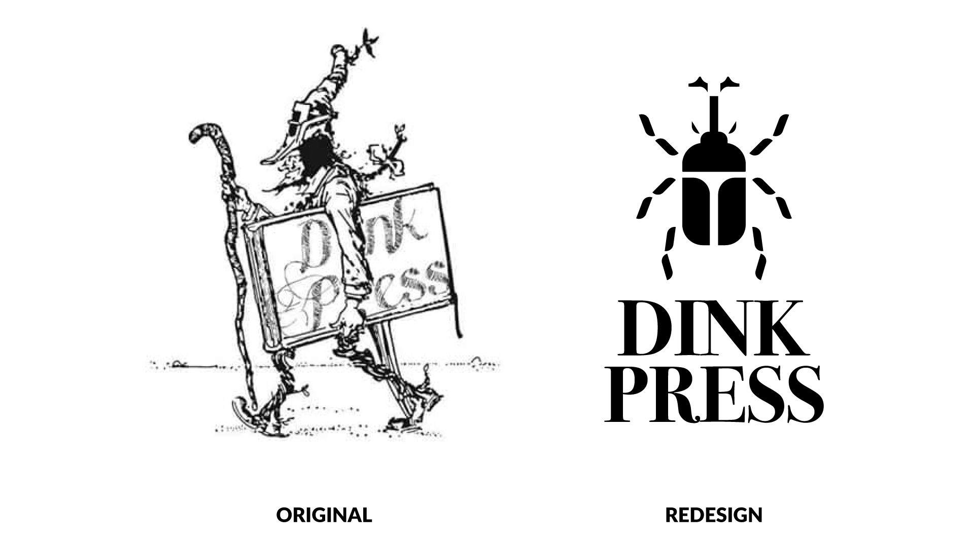
To properly redesign the Dink Press logo, I had to keep 3 things in mind: legibility, relatability, and personality. The logo must be recognizable across a myriad of platforms, from the spine of a small novel to a banner. The design should be relatable, something that anyone can see and understand personally. Finally, it must demonstrate the underdog personality that Dink Press has. Who better to look out for the little guy than the little guy?
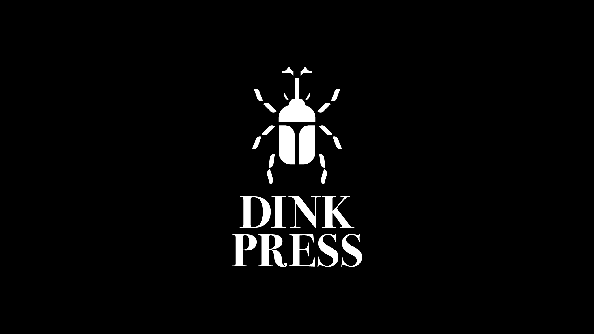
Flexibility
Turning the Dink Press logo into a combination mark gives it a new freedom, a flexibility to be featured in any and every format. Horizontal placement allows for website compatibility, while the vertical version enhances its placement in each book they print.
Where to go from here
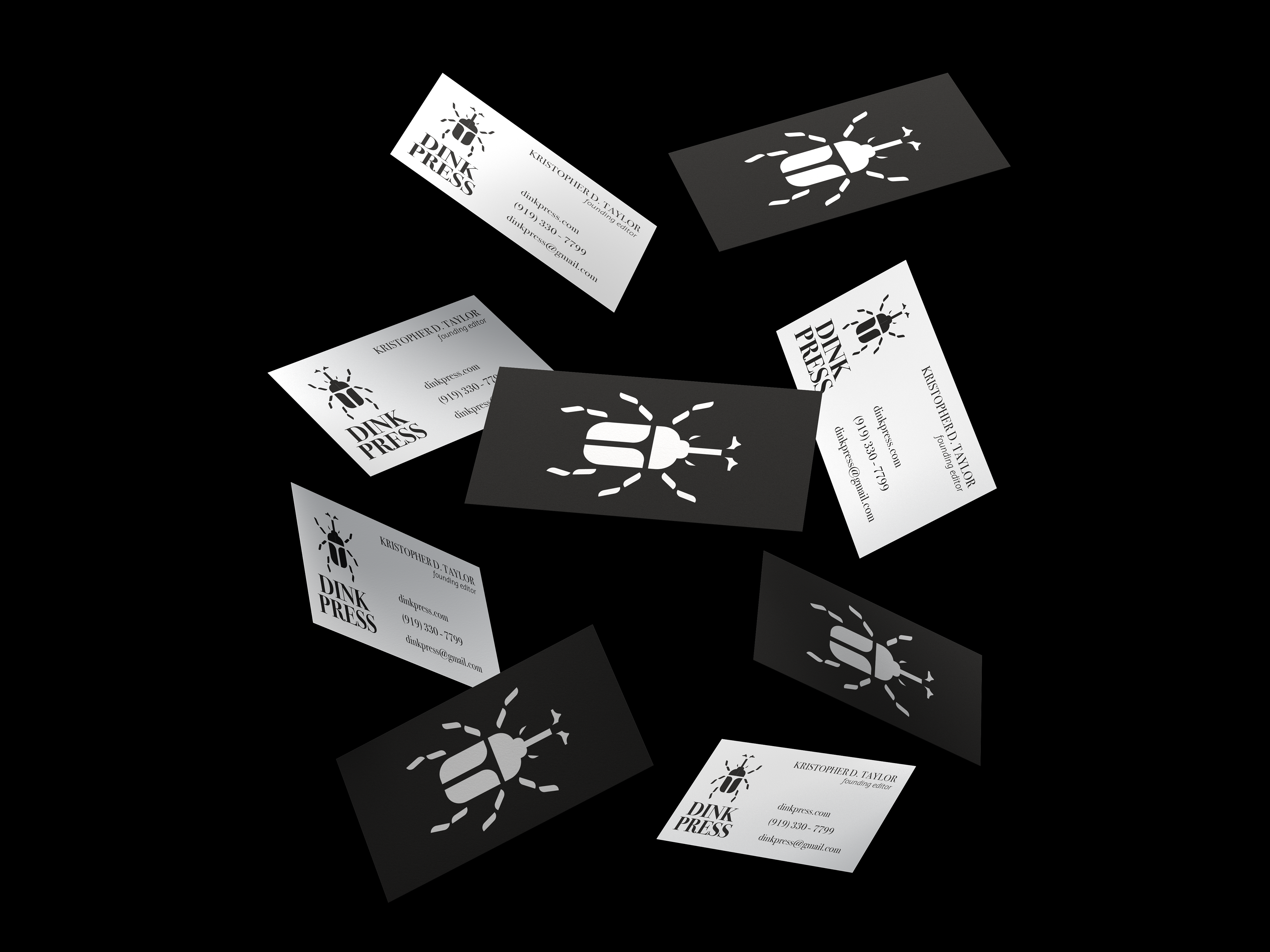
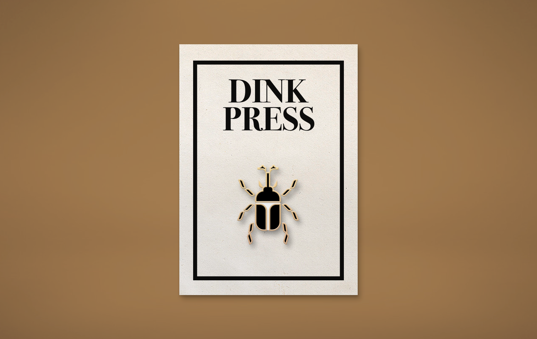
With an identity firmly in place, Dink Press can utilize this coherency to expand into merchandise. Pins, bookmarks, and t-shirt designs featuring the press' logo will bring them a new recognizability from a variety of audiences. Dink Press will break from their site into bookstores, onto the streets, and into people's homes.